Peacock's plan picker is doing several things right from a product management and subscription pricing standpoint.
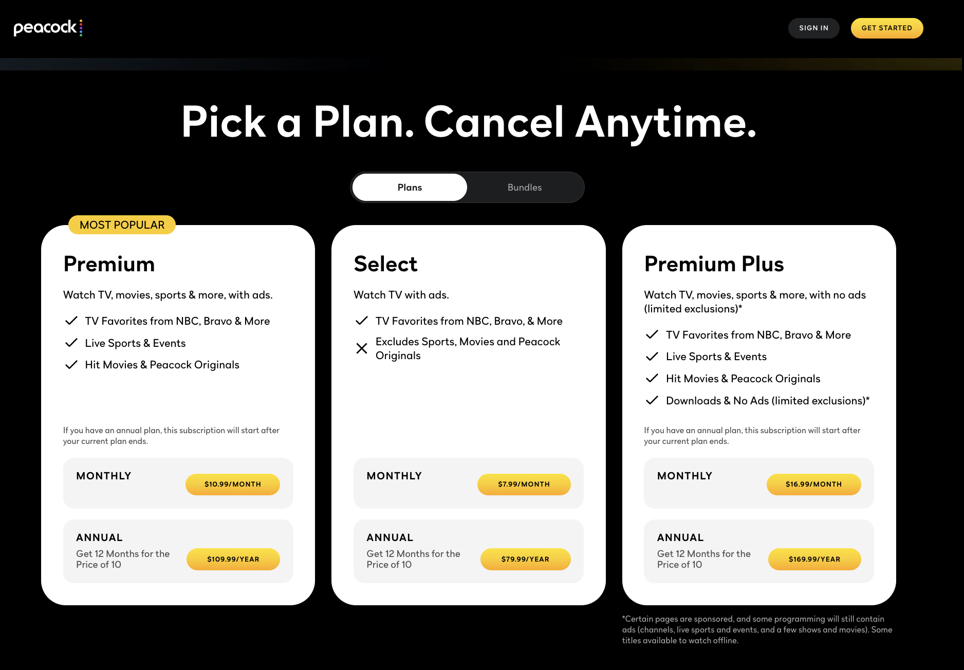
Five things this paywall gets right
- 1. Compromise effect. The $16.99 Premium Plus tier is performing an anchoring role. It is the most expensive option to make the $10.99 price look reasonable. Many users will pass on the $7.99 to avoid feeling cheap and will revert to the $10.99.
- 2. Killer feature isolation. The Select plan has a visible ✗ next to "Excludes Sports, Movies and Peacock Originals." Sports and movies are the reasons someone is seeing the paywall in the first place. By making the cheapest option actively block these, the page turns $7.99 into a soft decoy: technically a plan, but not really a real option. Almost everyone migrates to Premium or above.
- 3. Cancel Anytime header at the top. It is the first thing you read in the section header, before any price. For users (myself included), the pain of paying is real and immediate, while future benefits feel abstract. "Cancel Anytime" helps alleviate most of that pain.
- 4. Annual billing phrased as "12 for the price of 10." Most companies frame annual billing as a percentage discount: "Save 17%." Peacock is basically saying: "Two months a year are free." Good copy does not make you think or do math. "Two months free" requires no math. A percentage does.
- 5. Most Popular. The badge above Premium does two things at once. Users do not read, users scan. Researchers from different fields keep finding that consumers look for the first reasonable option and stop scanning, and the badge does the trick.
Five things I would test
- 1. The asterisk in the plan name. Premium Plus promises "no ads (limited exclusions)*", and the asterisk footnote reveals that some sports and movies still run ads. Users should not have to think at the moment of payment, and the asterisk makes you stop to think. I would test replacing the asterisk with "No Ads on On-Demand", so the exclusion is built into the framing.
- 2. Plans vs. Bundles as competing tabs. Before users read a single price, they have to decide which tab to open. That creates a decision before the decision. The Bundles tab bundles Apple TV+ and Peacock. The inclusion of Apple TV feels like it came out of nowhere, and the synergies are not clear. I would test removing the tab toggle and moving the bundle offer to a separate callout below the main plans, explicitly calling out the benefits of both products together.
- 3. Monthly as the default billing cycle. The toggle defaults to Monthly. Annual billing reduces the "moment of pain" from twelve times per year to one, thus increasing CLV. The question is whether preselecting annual scares off users who have not committed yet. Worth a clean A/B test.
- 4. No social proof anywhere on the page. Peacock is competing against a plethora of streaming services. A user weighing these options has no signal on this page about who recommends Peacock. The Most Popular badge is good to point out what Peacock subscribers choose, but does not clarify who buys Peacock. I would test this alongside a star rating or a short editorial pull quote near the CTA.
- 5. Page zoom. The first image you see on this post shows the entire paywall fitting on the screen. That is false. I had to zoom out to 70%. I would rearrange font and size to make it fit entirely at 100%. As is, the prices are left out of the visible area, making users think and adding more friction to the decision process.
The best paywalls don't just present pricing options. They structure the decision before the user realizes they're making one.
What do you think Peacock is doing well, and what would you test yourself?