Executive Summary
I spent a few hours walking net32.com the way a first-time dental-office buyer would: homepage, top nav, search entry point, sign-up, account preview, no login, no internal data, nothing but what any buyer or competitor can see. The goal wasn't to find bugs, it was to find where the site's own stated promises (savings, trust, "the most conversion-oriented offer") don't quite match what's actually shown. Four things stood out enough to write up, and they share a pattern: the underlying mechanics (Buy Box ranking, search relevance, tagging, recommendations) are probably fine, the problem is that none of them are visibly working for the buyer standing in front of them.
The findings (placeholder):
- The ranking logic behind Buy Box and search is invisible to buyers, unlabeled sponsored placements, and two "savings" tabs that don't actually sort by savings, are early signs of the same opacity problem playing out on the front end.
- Search has a working entry point but no visible sign it understands dental-specific vocabulary or reuses the practice-type signal the site already captures.
- The tagging and experimentation mandate needs marketplace-specific metrics (search-to-result rate, buyer-to-seller ratio) from day one, not a generic e-commerce funnel.
- Auto Order, a real recurring-purchase feature, is buried in an account dropdown instead of surfaced at the moment it's actually earned, right after a repeat purchase.
None of this is a case against the site. The homepage's "Recommended for you" grid, the trust-badge row, and the practice-type selector are all real, well-built pieces worth protecting exactly as they are, the fixes below are about connecting pieces that already exist, not rebuilding the site.
Built from a live, public walk of net32.com only. No internal funnel data, Snowflake or GA access, ranking weights, or experimentation history was available, so every finding below is a hypothesis grounded in what's observable, not a confirmed diagnosis.
Why This Exists
Company snapshot.
- Website: www.net32.com
- ~50 employees (headcount estimates across sources range roughly 49–68; treat as "small team, high-leverage role," not a large product org)
- HQ in Cary, North Carolina; founded by Dr. Pat Cassidy and Donna Cassidy
- Backed by Riverside Partners (Boston-based private equity), investment completed May 2024
- Positioning: online marketplace aggregating 60,000+ dental products from 5,000+ vendor and manufacturer catalogs, multiple sellers can list the same SKU
Net32's Senior PM, Conversion & Search role is a newly created position with a specific mandate: reduce friction across the marketplace and grow revenue per visit, owning Buy Box, search, recommendations, and the experimentation program that will measure all three. That mandate is more distinct than a typical CRO role because of what kind of marketplace this is. Net32 isn't selling one thing to one buyer, it's running a Buy Box where multiple vendors compete for the same SKU, the same mechanic Amazon runs, in a category (B2B dental supply) where the buyer is a practice owner or DSO purchasing agent, not a consumer clicking on impulse.
That buyer evaluates differently than a consumer shopper does. A dental office isn't buying gloves because they want them, they're restocking because they'll run out, so price, in-stock reliability, and fulfillment speed all carry more weight than they would for a one-off consumer purchase, and a stockout or a slow-shipping seller doesn't just cost one sale, it risks the whole account switching to a distributor with a rep who calls when something's about to run low. That's the physics of this category: not "convince someone to buy," but "make the obviously right offer obviously visible, fast, before the buyer's attention returns to running a practice."
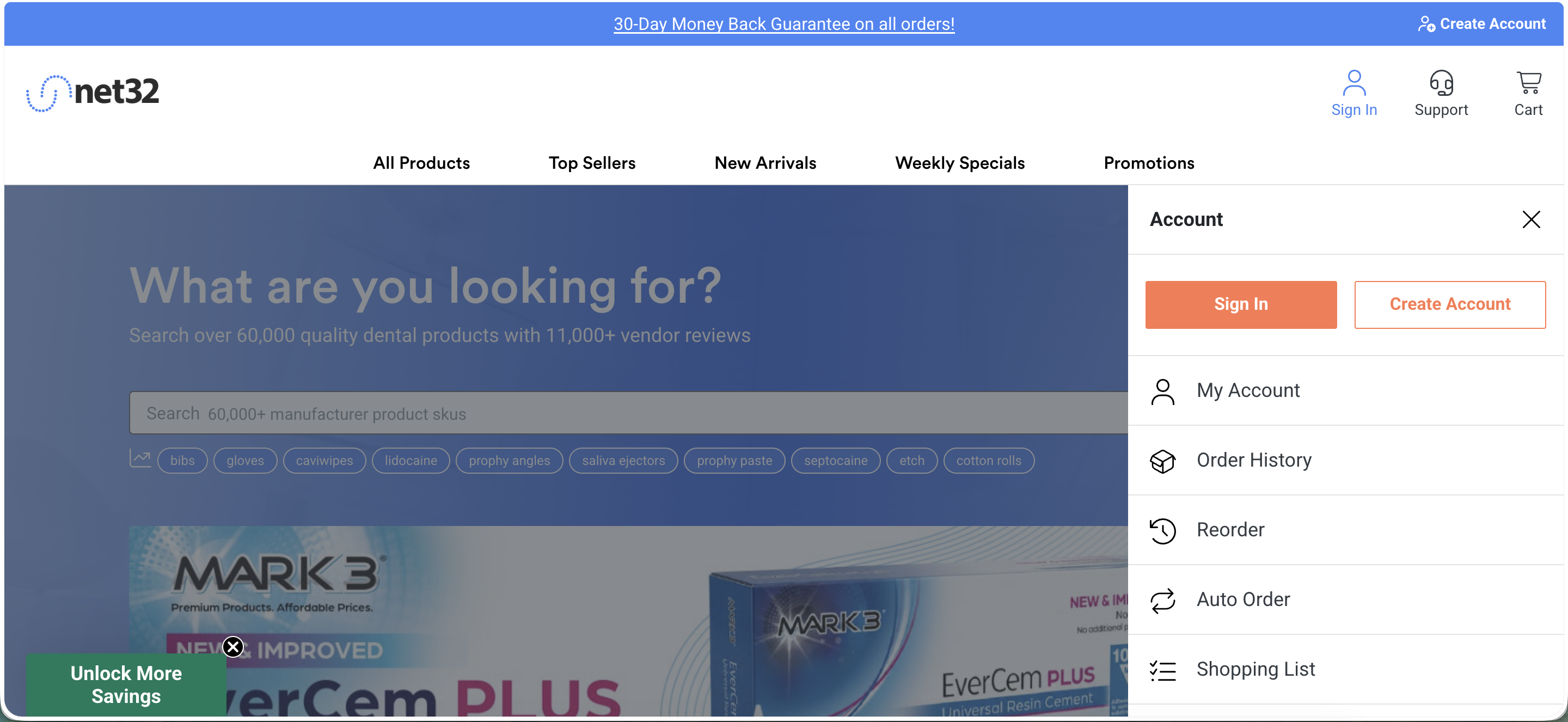
The homepage, top to bottom, as of the initial walk. Landing page only so far, the search results, product detail, and Buy Box screens still need to be captured.
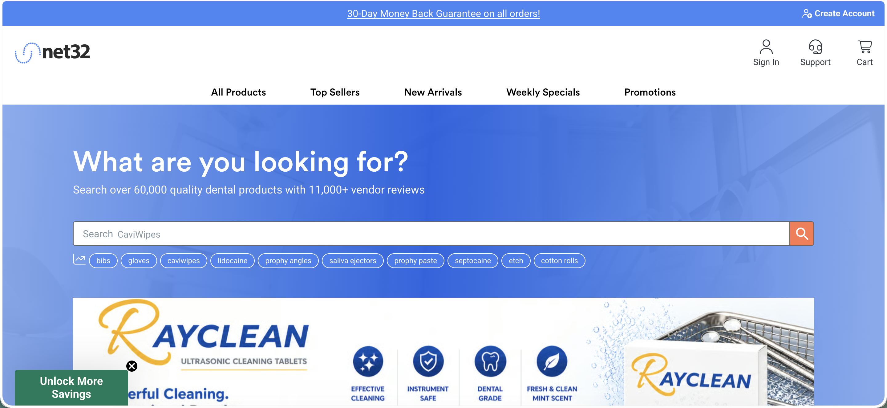
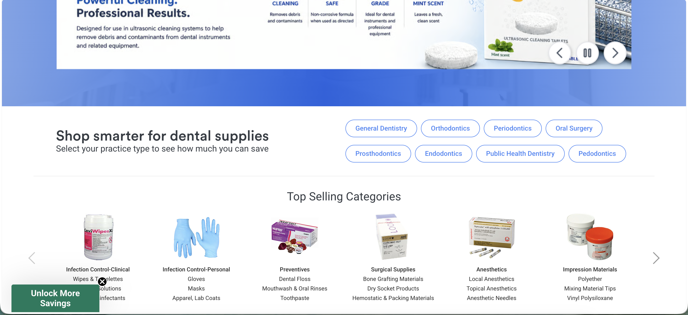
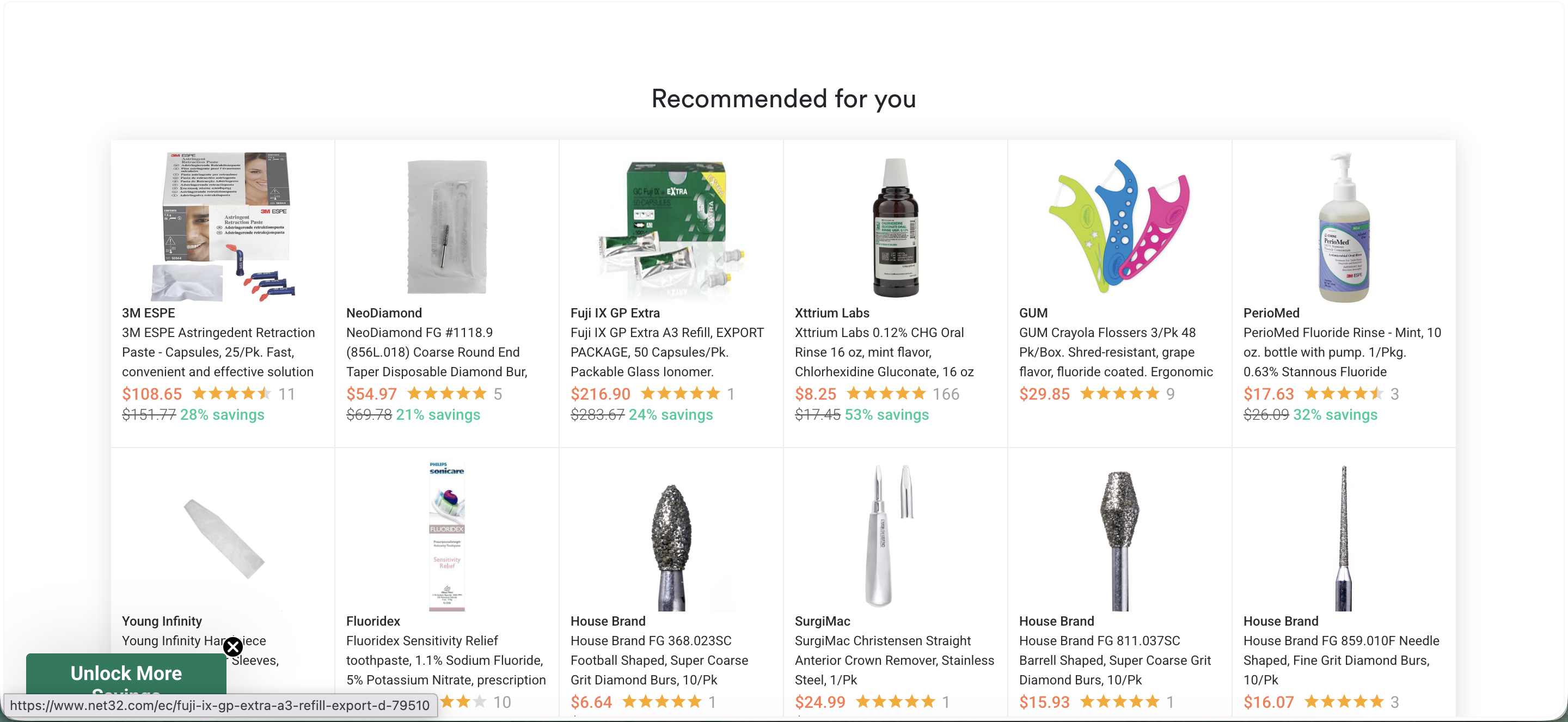
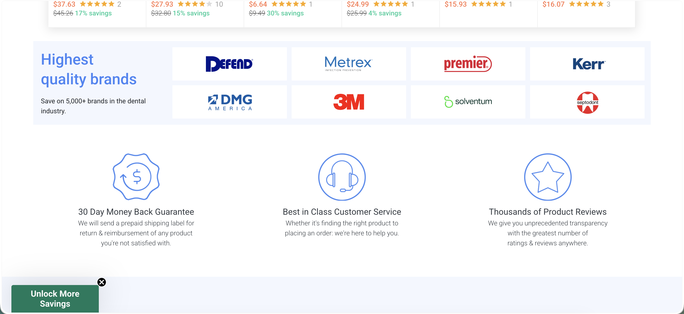
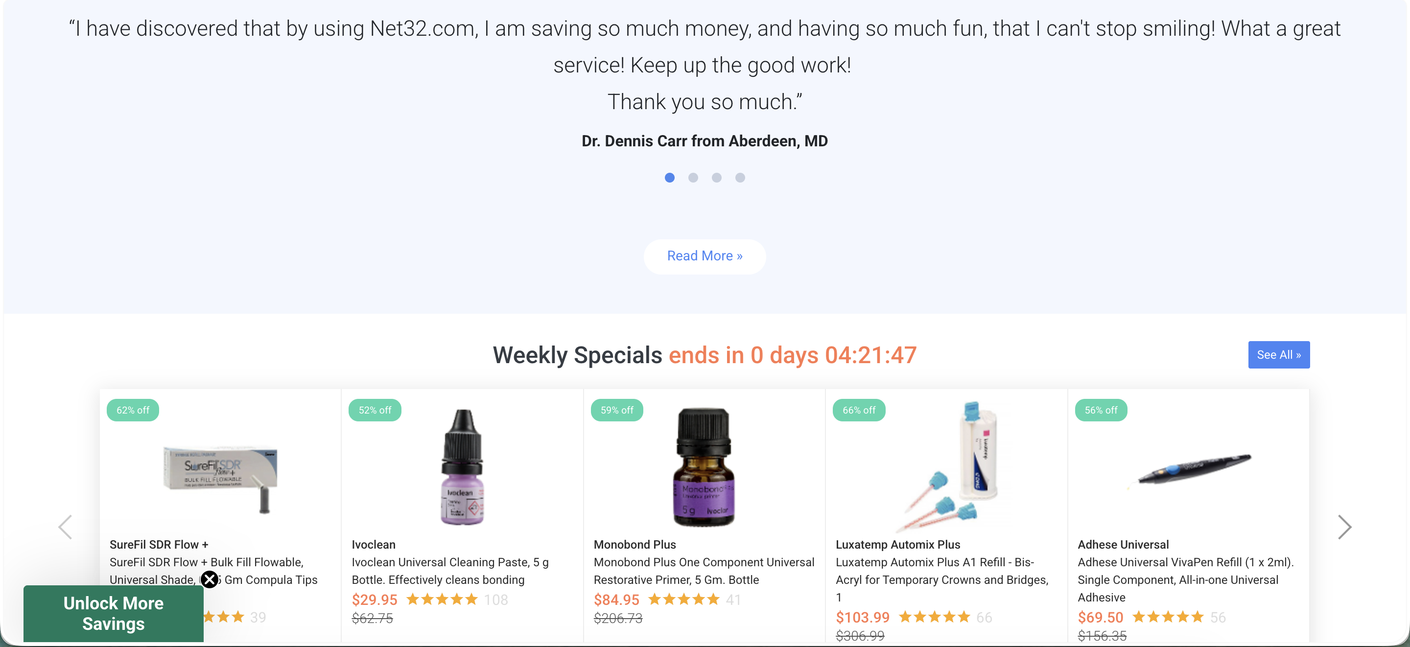
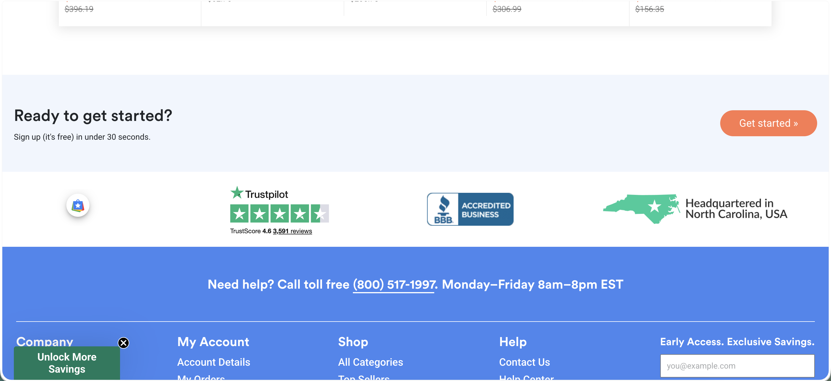
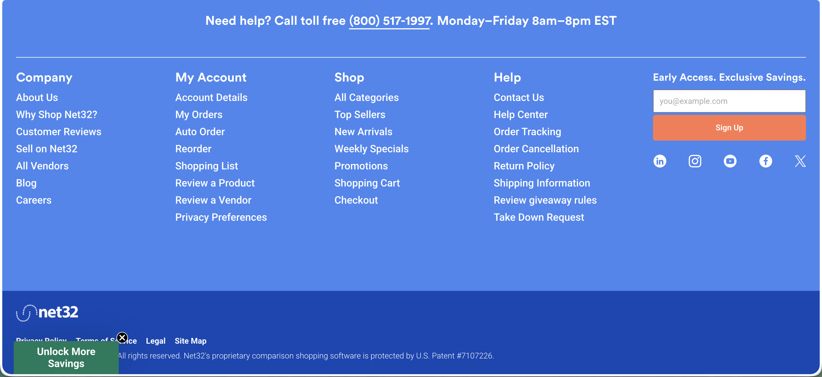
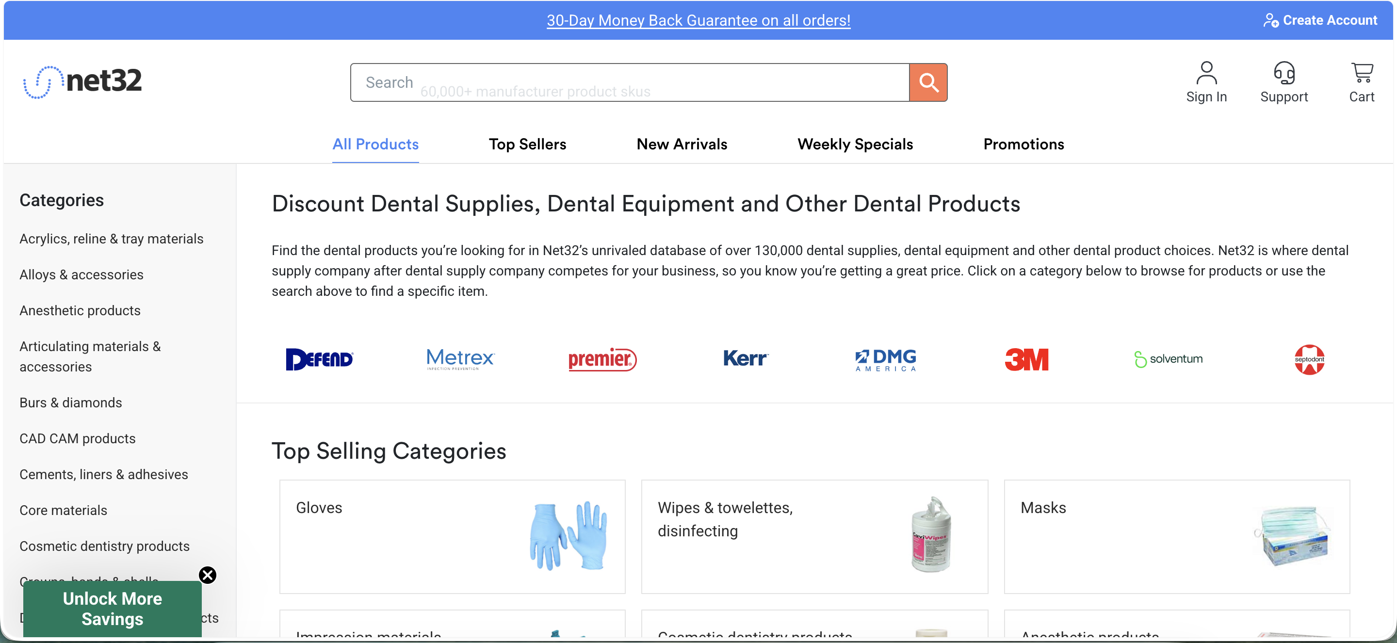
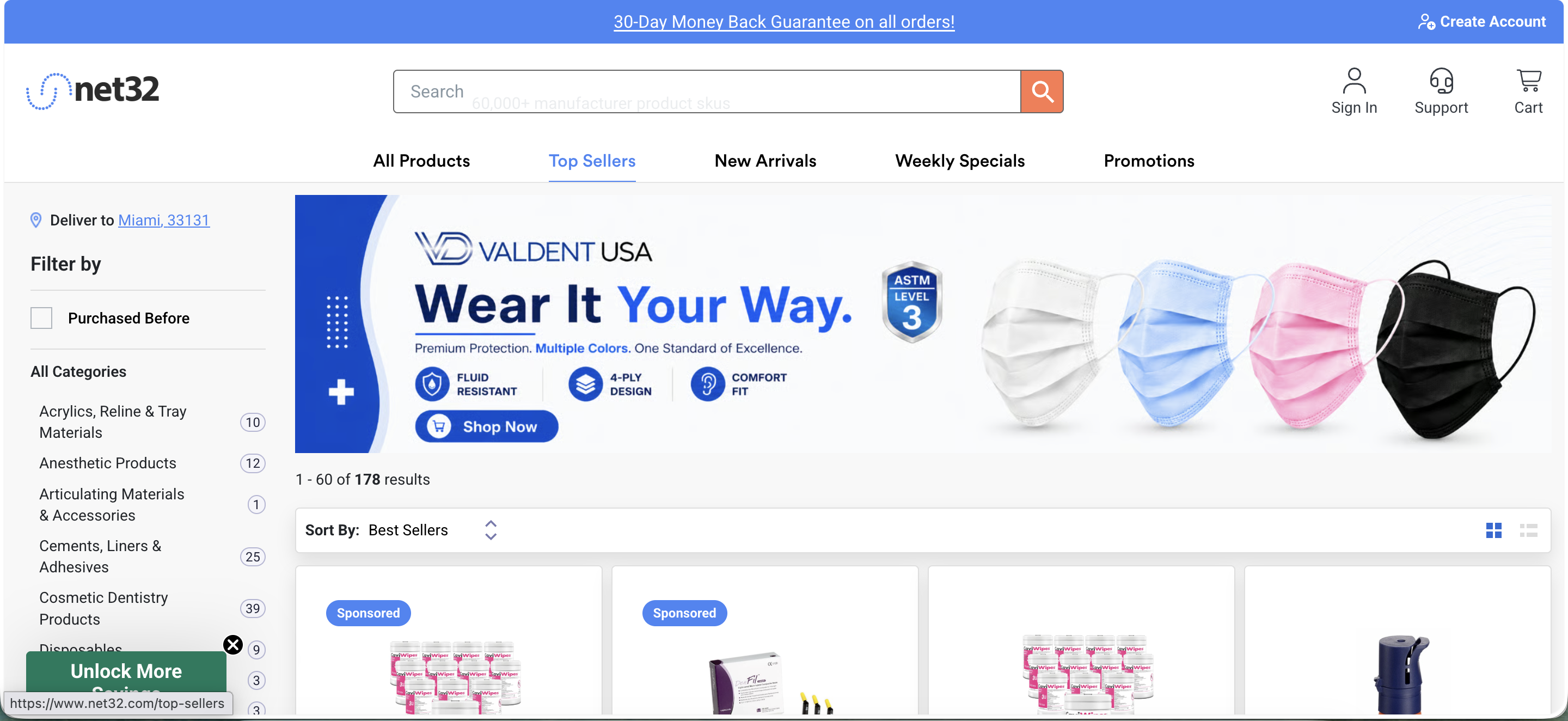
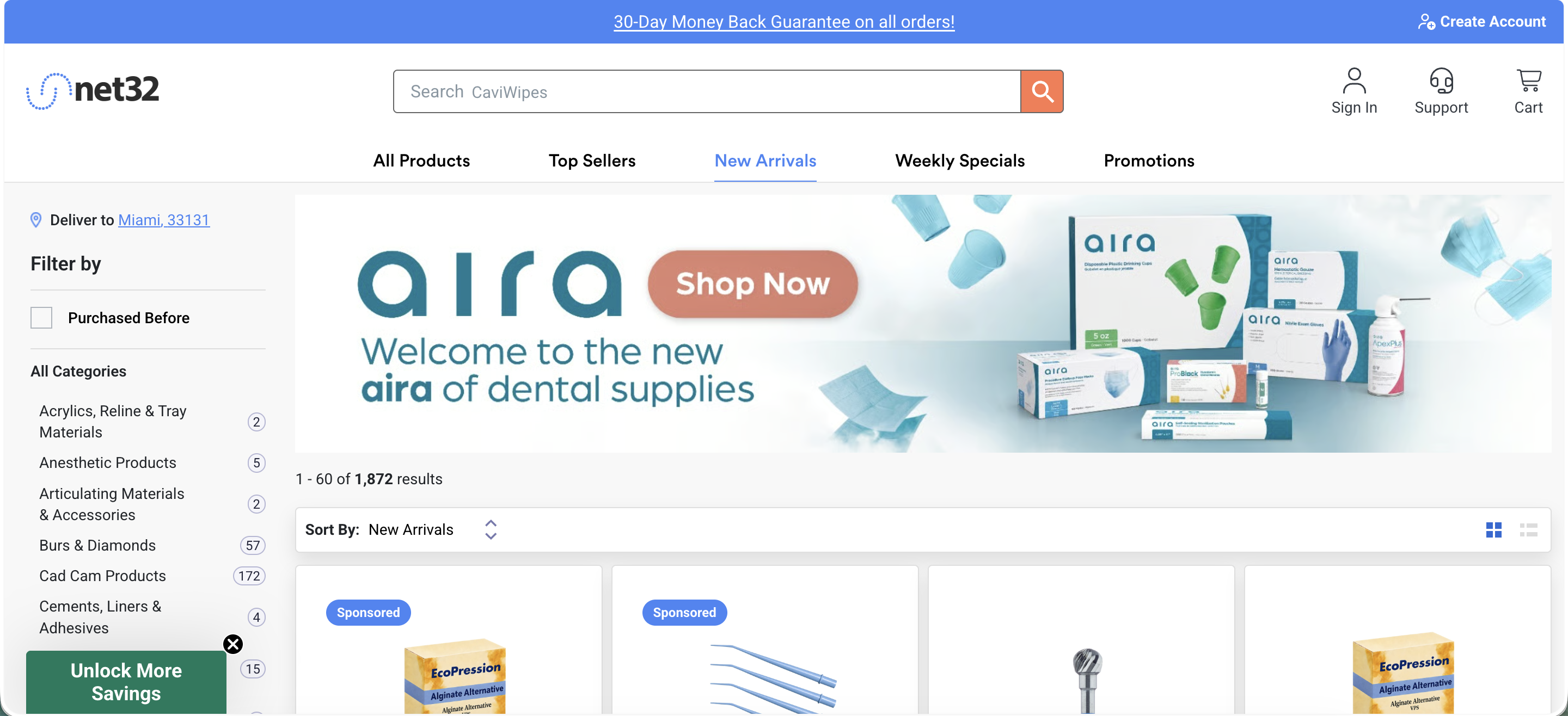
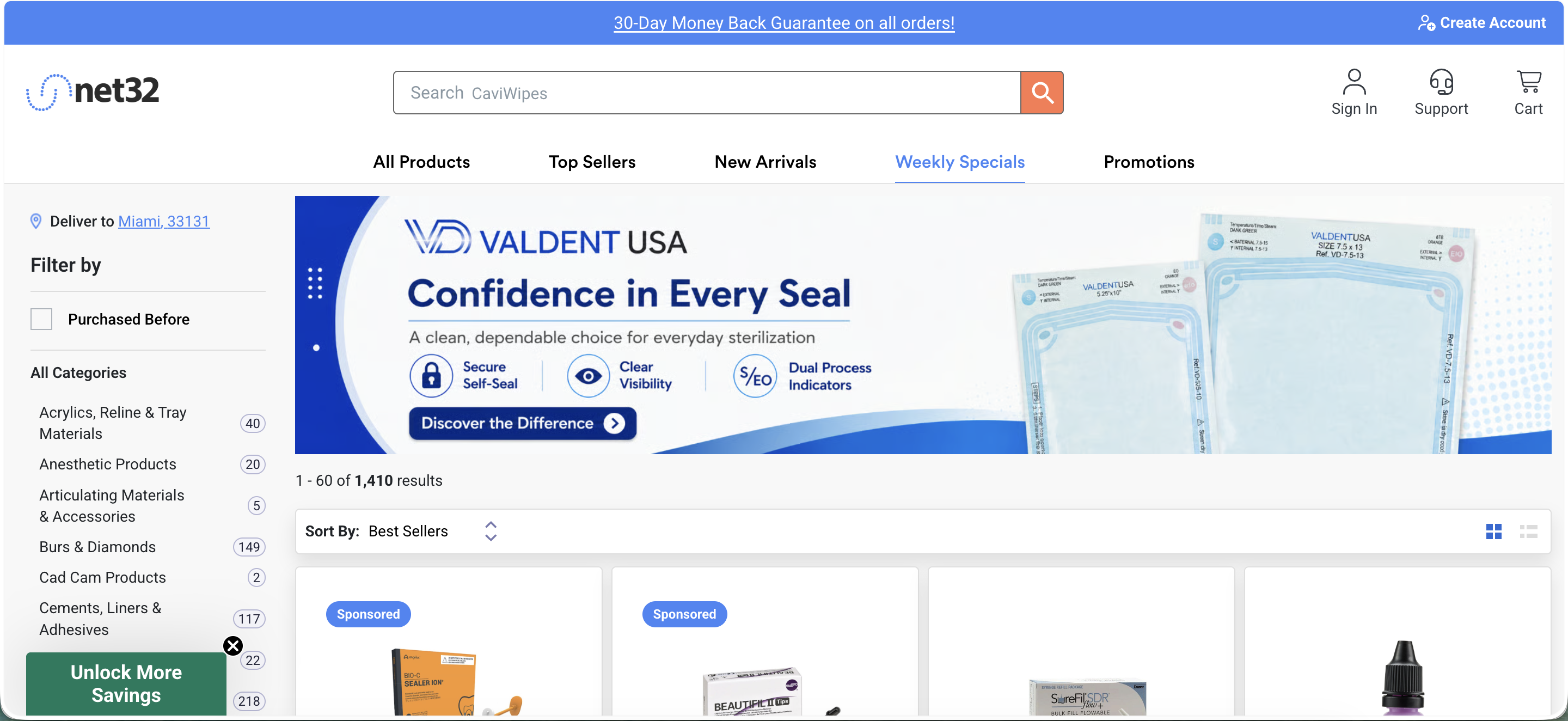
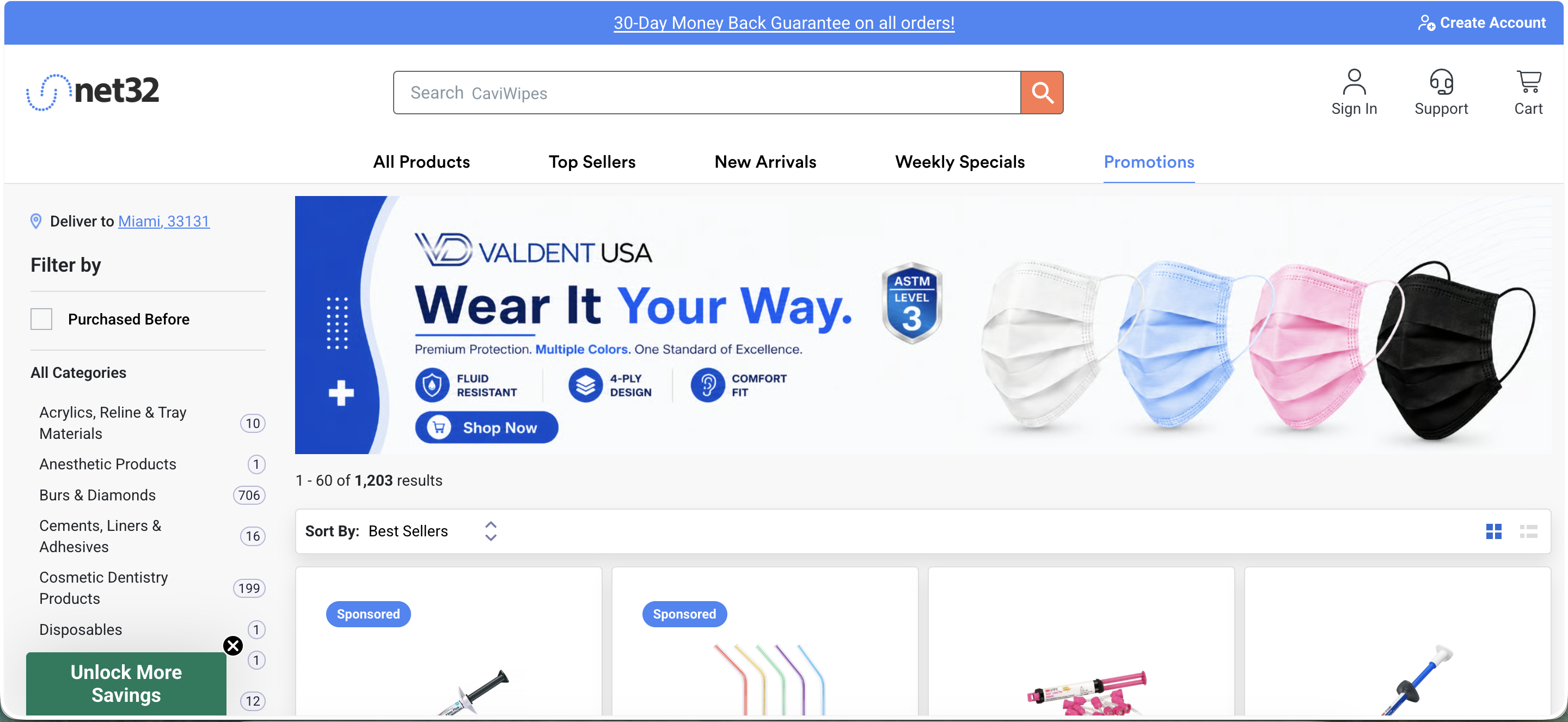
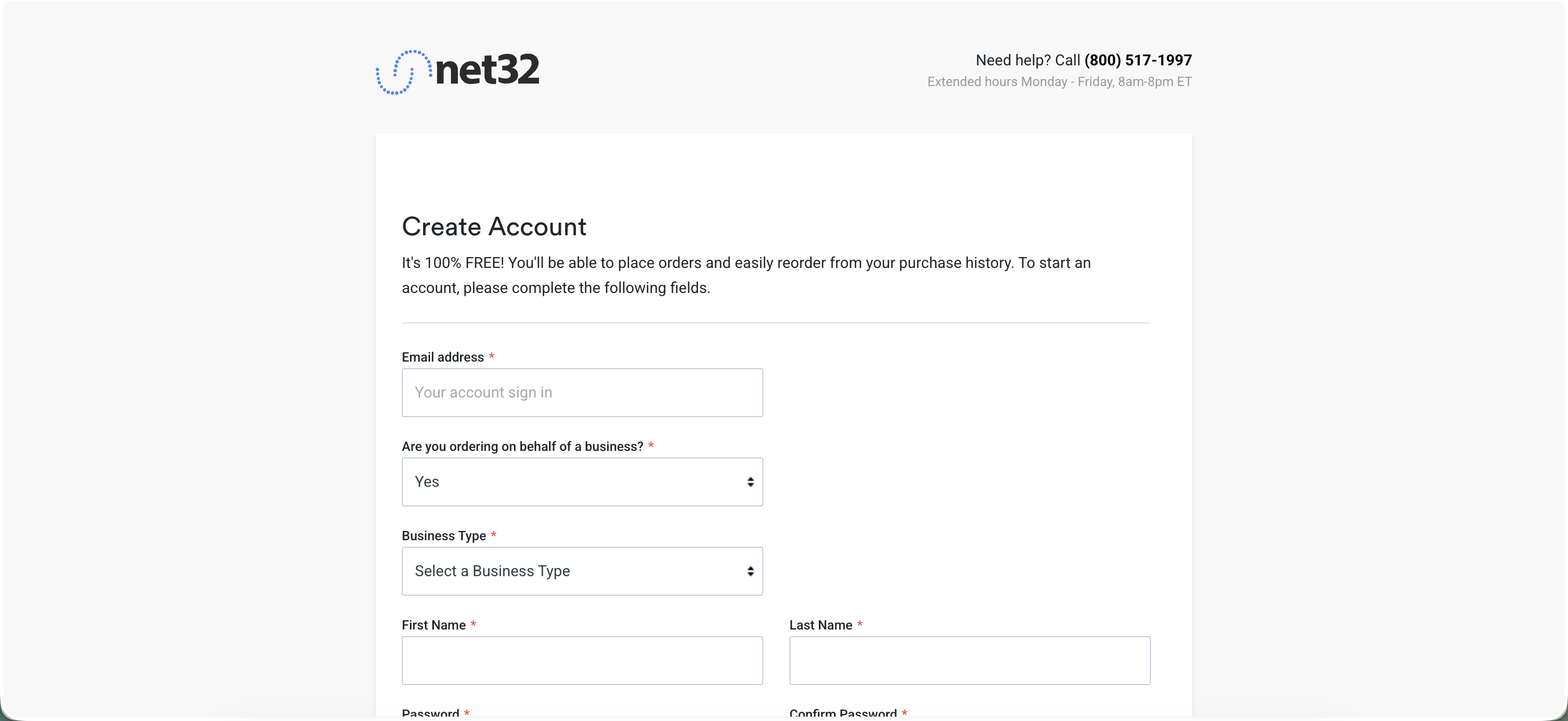
The top nav tabs (All Products, Top Sellers, New Arrivals, Weekly Specials, Promotions), then the Sign In and Create Account entry points.
Industry Trends
Dental supply is still overwhelmingly an offline B2B category: offline transactions made up roughly 87% of the dental consumables market in 2025, with online distribution the smaller but faster-growing slice, expanding at close to a 9.7% CAGR through 2031, well ahead of the offline channel.1 That gap is the opportunity: most of the category hasn't moved online yet, so there's real headroom for whoever builds the most trustworthy self-serve buying experience, not just the cheapest one.
Two forces are reshaping who's buying and how. First, DSO consolidation. Dental Service Organization affiliation has more than doubled since 2015 to about 16% of U.S. dentists, and the DSO market is projected to grow from roughly $45B in 2025 toward $196B by 2034. DSOs buy differently than solo practices: higher volume, more price-sensitive, more likely to have a designated buyer comparing multiple vendors rather than a single doctor ordering out of habit. A marketplace's Buy Box and search relevance matter more to this buyer, not less, because they're actively comparison-shopping instead of defaulting to whoever their rep called last. Second, group purchasing power is compressing distributor pricing across the board, which is part of why the traditional big three (Henry Schein, Patterson, Benco) are all investing in their own digital storefronts rather than ceding price-transparent categories to marketplaces.
The clearest signal of where the category is heading: Henry Schein, the largest player, spent 2024–2026 consolidating its previously fragmented digital storefronts into one platform (HenrySchein.com) built on Mirakl, a third-party marketplace-commerce platform, and by Q1 2026 had over 80% of U.S. dental e-commerce sales running through it. That's the same structural bet Net32 is already built on: a multi-vendor marketplace where the platform, not a single seller, controls ranking, findability, and the buying experience. The company that already has that architecture, rather than one retrofitting it, has a real head start, provided the conversion layer (Buy Box, search, CRO) is actually tuned to compete.
Why this matters. The market is shifting online at ~2x the offline growth rate, DSOs are becoming the highest-growth buyer segment, and the largest competitor just spent two years proving that marketplace mechanics (not a single-vendor storefront) are the right long-term architecture for this category. That's a strong external case for prioritizing Buy Box, search relevance, and a real experimentation program, ahead of competitors still mid-migration.
1. The ranking logic is invisible, and that's already showing up as a trust gap
What I saw. I can't see Net32's internal Buy Box or search-ranking logic, that lives inside their system. But from a public walk of the site, the effects of that logic are already visible, and they raise questions before I've even seen a single product page. Top Sellers and New Arrivals both mix "Sponsored" product cards into the results with no visible distinction beyond a small pill, no separate section, no explanation of what "Sponsored" means or how it relates to the rest of the ranking. Weekly Specials and Promotions, two tabs whose entire premise is savings, both default to "Sort By: Best Sellers" rather than sorting by discount, so the tab's own promise and its default ordering don't match. And four of the five top-nav tabs (Top Sellers, New Arrivals, Weekly Specials, Promotions) share nearly the same template and layout, differentiated mainly by which banner ad is running and how many results come back.
Why it matters. The ideal is a Buy Box that lets the most conversion-oriented offer win on price, availability, fulfillment speed, and trust signals. From a buyer's seat, none of those signals are visible, there's no badge, no "why am I seeing this" affordance, nothing that tells a dental office buyer whether they're looking at the objectively best offer or the one that paid for placement. That's the same pattern the ClearOne case study found in a completely different category: opacity around a decision that matters to the buyer reads as a reason to hesitate, not as neutral background mechanics. And it cuts both ways. The Key Concepts section above lists "zero transparency to sellers about why they lost the box" as a common Buy Box failure mode, this site shows early signs of the buyer-facing half of that same opacity problem.
What I'd do. None of this requires touching the core ranking algorithm to start. Two changes are within reach even without internal data: give the winning offer a visible reason ("Best price," "Fastest shipping," "Top-rated seller"), so buyers see why they're looking at what they're looking at, and separate sponsored placements from organic ranking with real visual distinction, not just a text pill, since the two are currently easy to mistake for the same signal. Alongside that, fix the low-hanging mismatch: make Weekly Specials and Promotions actually sort by discount by default, since that's the tab's stated premise and the fix is a sort-order change, not a ranking-model change.
The metric. Click-through and add-to-cart rate on the winning offer, before and after adding a visible reason code. Add-to-cart rate on Weekly Specials/Promotions before and after the sort-order fix. Longer term, seller-side metric: complaint or appeal rate about Buy Box outcomes, if that channel exists internally, since that's the direct signal for whether the vendor-facing opacity problem is real.
2. Search has a working entry point but no visible sign it understands the buyer or the domain
What I saw. No search results screens are captured yet, that's the next walk. But the entry point itself already tells you something: the homepage search bar's placeholder tags are "bibs, gloves, caviwipes," and caviwipes is a brand name (Metrex CaviWipes), not the generic category (disinfecting wipes). Net32 pairs that search bar with a completely separate, unconnected personalization signal, the "Select your practice type" selector (General Dentistry, Orthodontics, Periodontics, and so on) captured right on the same homepage. Nothing in what's publicly visible suggests those two systems talk to each other.
Why it matters. A useful framework here comes from a search-engineering textbook in my library: any discovery surface sits at the intersection of three circles, content understanding (matching keywords to the catalog), domain understanding (knowing dental-specific vocabulary, brand-vs-generic terms, abbreviations), and user understanding (knowing who's actually asking).5 A buyer who searches "disinfecting wipes" instead of "caviwipes" is testing the domain circle. A buyer whose account already says "Orthodontics" is sitting on an unused user-understanding signal every time they search. Improving relevance and ranking via Algolia is the natural next lever, and the book is blunt that plain keyword search (BM25) frequently outperforms fancier semantic search unless it's been tuned to the specific catalog, so the highest-leverage first move isn't a bigger model, it's making sure Algolia's synonym and ranking rules actually cover dental-specific vocabulary and that the practice-type signal already sitting on the homepage gets reused in search, not just the savings calculator.
What I'd do. Audit Algolia's synonym coverage for the obvious brand-vs-generic and abbreviation gaps in dental supply (CaviWipes vs. disinfecting wipes, and the dozens of similar pairs across the catalog) before touching anything more sophisticated. Feed the practice-type field into Algolia's custom ranking rules, the same signal that's already sitting unused for recommendations, so an Orthodontics buyer's search results, not just their "Recommended for you" row, reflect what they actually buy. And start logging a consistent signal schema now, every query, the results shown, the click, the add-to-cart, tied to a query ID, even before anyone builds a ranking model on top of it, since that log is the raw material for every later search improvement and is expensive to backfill once it's missing.5
The metric. Zero-results rate on real query logs (the fastest way to find domain-vocabulary gaps). Click-through rate on the top 3 results, split by whether the query used brand vs. generic language. Search-to-result rate as a marketplace health metric, the percent of searches that return at least one usable match, since a thin category or a vocabulary miss shows up here before it shows up in conversion.
3. The tagging and experimentation mandate needs marketplace-specific metrics, not generic funnel ones
What I saw. I can't see Net32's internal tagging or experimentation setup, that's exactly the kind of tagging and experimentation program this category is missing. But the public site gives a proxy signal worth naming: Weekly Specials and Promotions both default to "Sort By: Best Sellers" instead of sorting by discount, the kind of mismatch between a page's stated purpose and its actual default that usually survives specifically because nobody is watching a metric that would catch it. That's a a tagging gap made visible from the outside, not proof of one, but a reasonable inference.
Why it matters. A full site tagging audit, a real data capture strategy, and proper funnel analytics are foundational, must-do-first work, and a startup-metrics book in my library is specific about why a generic e-commerce funnel (visits, conversion rate, cart size) isn't the right lens for what Net32 actually is, a two-sided marketplace, which has its own metric set: buyer-to-seller ratio, inventory growth, search-to-result rate, and transaction completion rate, on top of the usual funnel.6 The book's other core idea, the One Metric That Matters, that at any given stage there should be a single number the whole team rallies around, maps directly onto the need for a testing program with defined success metrics, one that doesn't exist yet. Without that discipline, a newly built tagging system risks capturing everything "just in case" instead of the handful of numbers that would actually catch a Weekly-Specials-style mismatch before it sits live for months.
What I'd do. Before the tagging audit produces a giant list of events to track, pick the two or three OMTM candidates for this specific team's first quarter, likely revenue per visit as the north star and search-to-result rate or transaction completion rate as an early diagnostic, and design the tagging audit around making those numbers trustworthy first, not around capturing everything. Separately, run a lightweight, no-internal-access-required version of a usability audit on the funnel itself: at every step (search, product page, Buy Box, cart, checkout), can a first-time buyer immediately answer "what page am I on, what are my options, how do I search," the standard test from a usability book in my library for whether navigation is actually working.7 The nav tabs finding from earlier (four of five sharing a near-identical template) is exactly the kind of thing that test surfaces, and it's a check that can run in week one, with zero data-warehouse access, while the real tagging audit is still being scoped.
The metric. Whatever the first-quarter OMTM turns out to be, held to an explicit target set before data collection starts, not after (the book's "line in the sand" discipline6), plus cohort-based tracking from day one rather than aggregate averages, since aggregating cohorts is the classic way a stagnating funnel is made to look healthy on a dashboard.
4. Auto Order is a retention lever sitting one click away from the homepage, and it's invisible until you're already signed in
What I saw. The Sign In dropdown, visible to a logged-out visitor before they've even created an account, already lists Order History, Reorder, Auto Order, and Shopping List. That's a real, already-built recurring-purchase mechanism for a category (dental consumables, gloves, bibs, disinfecting wipes) that is close to the textbook definition of a repeat-purchase, replenishable product. Nothing on the homepage, product pages, or nav tabs surfaced so far promotes Auto Order directly, it's previewed in a dropdown and otherwise left to whoever thinks to look for it in account settings.
Why it matters. A recurring theme across behavioral-product research is that the highest-leverage retention moment is the one where a user invests effort into the product, since that investment is what makes leaving feel like a loss rather than a neutral return to zero.8 Setting up Auto Order is exactly that kind of investment, and for a B2B buyer who reorders the same consumables monthly, it's also a genuine time-saver, not a dark pattern. Right now it's buried at the exact opposite of where investment-building surfaces should sit, deep in an account menu instead of at the moment right after a first purchase when the buyer has just proven they'll reorder this SKU. There's also a segmentation question worth asking before optimizing "Recommended for you" further: buyers who enroll in Auto Order are very likely a structurally different, higher-value cohort than one-off buyers, the same high-value-active vs. low-value-active split a network-effects researcher found was the key to Dropbox's own monetization pivot,9 and that split, not raw signup count, should probably be the number that judges whether an acquisition or CRO change is actually working.
What I'd do. Surface an "Auto Order this" prompt at the two moments it's actually earned: right after a repeat purchase of the same SKU, and on the order-confirmation screen for consumable categories (gloves, bibs, disinfecting wipes) where reordering is close to certain. Pair it with a simple cross-sell layer at the reorder moment itself, "commonly reordered together" rather than generic "Recommended for you," since a buyer who's actively reordering gloves is a much stronger signal for what else they'll reorder than a first-time browser is for anything. And start splitting "Recommended for you" and CRO metrics by Auto Order-enrolled vs. one-off buyer before assuming both cohorts respond the same way to the same changes.
The metric. Auto Order enrollment rate, ideally split by category (consumables should convert far higher than capital equipment). Reorder cadence adherence (did the auto-order actually fire and get fulfilled on schedule). Cross-sell attach rate at the reorder moment specifically, not blended into the general recommendation rail. Longer term, LTV delta between Auto Order-enrolled and one-off buyers, since that gap is the business case for investing further here.
What's already working
Four things worth protecting exactly as they are, since a common failure mode in a "fix everything" mandate is breaking something that was already earning its keep.
- "Recommended for you." Price, star rating, review count, and a percent-savings badge on every card, the clearest, most complete signal set anywhere on the homepage. This is the surface to extend the practice-type signal into (Ideas to Test #3), not rebuild.
- The practice-type selector. A real, explicit personalization signal captured right on the homepage, at zero cost to the buyer. It's underused (Findings 2 and 4), but the capture mechanism itself is exactly right, don't replace it with an inferred or purchase-history-based system.
- Sign In dropdown surfacing account value before login. Order History, Reorder, Auto Order, and Shopping List are all previewed to a logged-out visitor. That's a genuinely good pattern, showing the value of an account before asking for one, worth reusing when surfacing Auto Order more prominently (Finding 4).
- The trust-badge row itself. Trustpilot (4.6, 3,591 reviews), BBB Accreditation, and the North Carolina HQ badge are strong, specific, real signals, better than most competitors bother to show. The fix isn't the content, it's the placement (Ideas to Test #6): move a compact version of it closer to the actual purchase decision.
How I'd measure it
North star. Revenue per visit (RPV). It's the right choice here specifically because it can't be gamed by a Buy Box change that wins more clicks but pushes buyers toward a cheaper offer, or a search change that lifts click-through but not actual orders, both failure modes a narrower metric (CTR, conversion rate alone) would miss.
The guardrail I'd hold myself to. Repeat-order rate and Auto Order enrollment, tracked as a cohort, not a snapshot. RPV can rise short-term from tactics (aggressive Buy Box tuning toward the cheapest offer, pushier upsells) that quietly erode the reason a dental office reorders from Net32 instead of calling their old distributor rep. If RPV goes up while repeat-order rate or Auto Order enrollment goes flat or down, that's the signal the wins aren't real.
The funnel I'd instrument. Search or landing entry, results/category browse, product page, Buy Box interaction (which offer was shown, which was clicked, why), add to cart, checkout start, payment, order confirmation, and, critically, a post-purchase stage most CRO funnels stop short of: reorder or Auto Order enrollment within the replenishment window for that SKU. For a marketplace this is the two-sided version too, seller-side signals (fill rate, time-to-ship, Buy Box win rate) feed the same funnel from the supply side.
Where I'd start
- 1 Fix the sort-order mismatch on Weekly Specials and Promotions, and add a visible reason code to the Buy Box winner. Both are UI and sort-order changes, not ranking-model work, shippable in the first sprint, and both directly close the gap between what the site promises (savings, the best offer) and what it actually shows first. Fast, low-risk, and immediately measurable, exactly the kind of early win a newly created role needs to build credibility before tackling anything that touches the ranking algorithm itself.
- 2 Stand up the signal schema and marketplace-specific metrics before the formal tagging audit finishes. Query, results, click, add-to-cart, purchase, tied to a query ID, plus search-to-result rate and buyer-to-seller ratio as day-one dashboards. Every later search, Buy Box, and recommendation improvement in this doc depends on this data existing, and it's cheaper to build now than to backfill once the "real" tagging audit is already underway.
- 3 Surface Auto Order at the moment it's earned, and run the A/A test. Auto Order is the highest-leverage retention lever already built and sitting unused; moving it from an account-menu afterthought to a post-repeat-purchase prompt requires no new infrastructure. In parallel, run the A/A test that validates the testing platform itself, so the first real Buy Box or search experiment that follows can actually be trusted.
Ideas to test
Seven concrete, testable ideas, each grounded in something actually observed on the site plus a specific reference point from experimentation, platform theory, or behavioral research. None of these require seeing Net32's internal ranking logic to propose, and none of them are guesses, each has a reason attached.
- 1 Sort Weekly Specials and Promotions by discount percentage, not "Best Sellers." Both tabs currently default to Best Sellers despite their entire premise being savings. Simple change, no ranking-model work required, directly closes the gap between what the tab promises and what it shows first. Hypothesis: add-to-cart rate on these two tabs rises when the default sort actually reflects the tab's purpose.
- 2 Add a visible reason code to the Buy Box winner. A small label, "Best price," "Fastest shipping," "Top-rated seller," next to the default offer. From Platform Revolution: the Buy Box is the platform's Filter, the core matching mechanism, and right now it's invisible to buyers, which is exactly the kind of opacity that erodes trust in a two-sided marketplace.2 Hypothesis: click-through and add-to-cart on the winning offer rises when buyers can see why it won.
- 3 Use the practice-type selector as a real personalization signal, not just a savings calculator. The homepage already captures "General Dentistry," "Orthodontics," "Periodontics," and so on, an explicit, knowledge-based preference signal,3 the kind that works immediately with zero purchase history, unlike collaborative filtering. Feed it into "Recommended for you" and search ranking. Hypothesis: an Orthodontics practice sees a different, more relevant top-6 recommendation set than a General Dentistry practice, and that lift is measurable in click-through on the recommendation rail.
- 4 Track catalog coverage on "Recommended for you," not just its click-through rate. Flagged in Aggarwal's textbook as the most common way a "good on paper" recommender fails commercially: high accuracy while quietly recommending the same popular SKUs to everyone, suppressing long-tail discovery.3 This isn't a UI test, it's a measurement gap worth closing before optimizing the rail further, since optimizing the wrong metric here could make the recommender look better while actually narrowing it.
- 5 Run an A/A test before the first real Buy Box or ranking experiment. Since this would mean building the experimentation program essentially from scratch, an A/A test, both groups identical, no real change, is the standard first move4 to confirm the testing platform itself is unbiased: no sample ratio mismatch, no systematic skew in how users get bucketed, before trusting any real test result that follows.
- 6 Move the trust badges (Trustpilot, BBB, 30-day guarantee) from the homepage footer to the moment of decision. They currently sit at the very bottom of the page, after the CTA and past the trust-badge row most buyers will never scroll to on a product or Buy Box screen. Authority and social-proof signals work hardest right at the point of hesitation, not buried below the fold on a page the buyer isn't even on.8 Hypothesis: repeating a compact trust signal (star rating, review count, guarantee) next to the Buy Box winner, not just on the homepage, lifts add-to-cart on first-time buyer sessions specifically.
- 7 Test consolidating or clearly differentiating the four near-identical nav tabs. Top Sellers, New Arrivals, Weekly Specials, and Promotions share close to the same template, differentiated mainly by banner ad and result count. A usability framework in my library treats this exact pattern as a warning sign: users satisfice, they click the first reasonable option rather than the objectively best one, so ambiguous, look-alike nav items get clicked based on position, not intent.7 Hypothesis: giving each tab a genuinely distinct visual identity (or merging the weakest-performing two) improves the match between what a buyer clicks and what they were actually looking for, measurable as a lower bounce-back-to-nav rate.
One structural caution worth flagging before any Buy Box test ships. Because Net32 is a two-sided marketplace, boosting one seller's offer in a test mechanically reduces exposure for competing sellers on that same SKU, a classic violation of the "one user's assignment doesn't affect another's outcome" assumption (SUTVA) behind standard A/B testing.4 A plain per-user split will produce contaminated, untrustworthy results for any Buy Box change. Cluster or time-based randomization (test a category for a full week, then switch, rather than splitting individual sessions) is the standard fix.
A note on scope
This was built from a live walk of the public marketplace, homepage, top nav, sign-up, account preview, plus public information about Net32's category and two competitors' public sites. Search results, individual product pages, the actual Buy Box in action, and checkout are not yet captured, that's the next walk. No internal funnel data, Snowflake or GA access, ranking weights, or experimentation history was available at any point. Every finding, priority, and metric above is a hypothesis built from outside evidence, not a confirmed diagnosis, and the first weeks of any real engagement here would be spent validating or discarding each one against the real data.
Notes
- Dental consumables market and channel-split figures from Mordor Intelligence's Dental Consumables Market report; DSO affiliation and market-size figures from industry DSO market research cited alongside it. Sources: Mordor Intelligence – Dental Consumables Market; Henry Schein e-commerce consolidation and Mirakl-platform figures from Digital Commerce 360, "Henry Schein hits ecommerce platform goal in Q1" and Digital Commerce 360, "Henry Schein expands into dental supply marketplace". ↩
- Geoffrey G. Parker, Marshall W. Van Alstyne, and Sangeet Paul Choudary, Platform Revolution: How Networked Markets Are Transforming the Economy and How to Make Them Work for You (Norton, 2016). Core interaction framework (Participants + Value Unit + Filter), network effects, multi-homing, and platform monetization vectors. ↩
- Charu C. Aggarwal, Recommender Systems: The Textbook (Springer, 2016). Knowledge-based recommendation as the standard fix for new-user cold start, NDCG as the correct ranking metric for short top-N lists, and catalog coverage as a first-class evaluation metric alongside accuracy. ↩
- Ron Kohavi, Diane Tang, and Ya Xu, Trustworthy Online Controlled Experiments: A Practical Guide to A/B Testing (Cambridge University Press, 2020). A/A testing as a platform-validation step, and SUTVA (Stable Unit Treatment Value Assumption) violations in marketplace/network settings, with cluster- or time-based randomization as the standard fix. ↩
- Trey Grainger, Doug Turnbull, and Max Irwin, AI-Powered Search (Manning, 2025). The "dimensions of user intent" framework (content, domain, and user understanding), BM25 vs. semantic search, and the standard query-signal schema (query, results, click, add-to-cart, purchase) tied to a query ID. ↩
- Alistair Croll and Benjamin Yoskovitz, Lean Analytics (O'Reilly, 2013). Two-sided marketplace metrics (buyer-to-seller ratio, search-to-result rate, transaction completion rate), and the One Metric That Matters / "line in the sand" discipline. ↩
- Steve Krug, Don't Make Me Think, Revisited (New Riders, 2014). The Trunk Test for navigation and funnel steps, and the observation that four of five nav tabs sharing a near-identical template is a symptom the test is built to catch. ↩
- Nir Eyal, Hooked: How to Build Habit-Forming Products (Portfolio, 2014). The Investment phase of the Hook Model, and why user effort (setting up a recurring order) creates a switching cost that a neutral feature doesn't. ↩
- Andrew Chen, The Cold Start Problem (Harper Business, 2021). The High-Value-Active vs. Low-Value-Active segmentation Dropbox used to judge growth quality, not just growth volume. ↩